Are We on the Edge of a Commodities Boom?
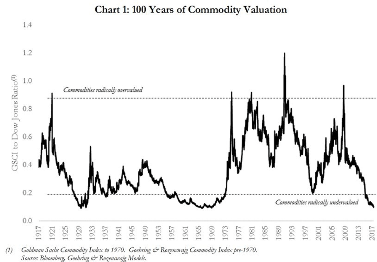
There is a widespread consensus that we are just about to embark upon a long-lasting commodities boom. The most common rationale for that thought is that the ratio between equity prices and commodity prices is very low.
The most common measure is the GSCI (Goldman Sachs Commodity Index) versus a US stock index, such as the Dow Jones, as shown in the chart below.
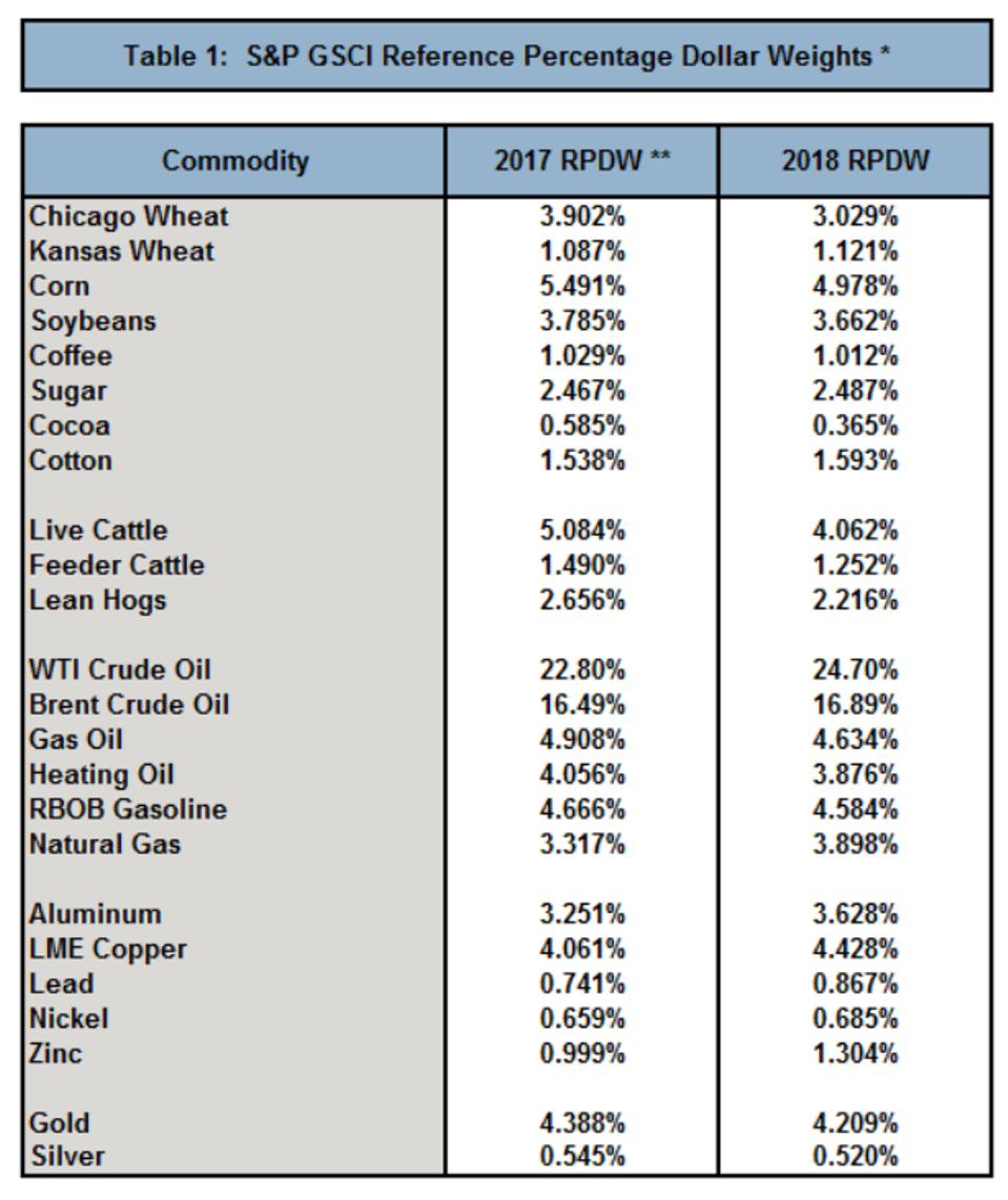
Many commentators take the GSCI as a proxy for hard commodities such as metals and iron ore. Well iron ore isn’t in the index and metals, ex gold and silver, are only around 10% of the index, as shown in the chart below. The index is heavily biased towards energy, and of course oil has been doing rather well of late.
The GSCI is not the only commodity measure. The Bloomberg Commodity Index weights industrial metals at 17.4%, precious metals at 15.3% and energy at 30.6%.
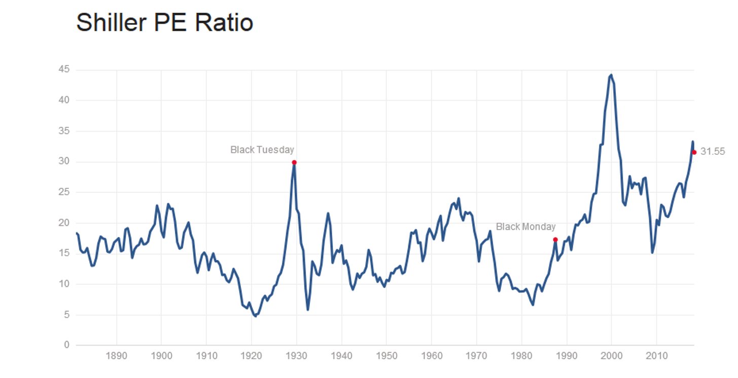
On the other hand stocks look expensive. For example, the Shiller P/E ratio in the chart below is as high as it was in 1929. The mean since 1880 is 16.85, it is presently 31.55.
Conclusion
The GSCI is not a proxy for metals and minerals that are exported from Australia. For example, iron ore and coal are not even in the index. The index is biased towards energy (correctly so in my opinion) and this sector is certainly looking bullish.
Stocks look expensive by many measures, not just Shiller P/E. While this bull market may continue for some time, risk aversion will eventually set in, perhaps triggered by some exogenous shock.
In sum, the GSCI is not necessarily a useful indicator of a metals and minerals boom.


