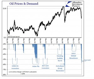
The Best Chart I have seen on Oil Prices
Last month I concluded that the fall in the Baltic Dry Index was demand related. The oil price (Brent and West Texas Intermediate) suffered a similar precipitous decline over the same period.
We have all read numerous theories on why the oil price has declined so much. Some examples:
- The Saudis are over pumping to keep prices low and destroy US shale oil production. [But shale oil production has been growing strongly for around four years. Why now and where is the evidence?]
- The US is deliberately depressing prices as part of its plan to destroy Russia. [But the declining Rouble is providing some protection to Russia as their oil is priced in USD. The US oil sector is being harder hit.]
- Mainstream media have speculated that the TBTF banks have manipulated the oil market to their own ends. [Without a shred of evidence.]
The excellent chart below is from Alhambra Investment Partners. It shows a very strong correlation between recessionary periods and lower oil prices. The only exception, in 1993, was due to temporary oversupply by OPEC in a flat market.
The conclusion is clear. The oil price has fallen because of falling demand. Same as the Baltic Dry. This is, of course, contrary to the Central Bank meme that things are on the up and everything will be fine.
Conclusion
While oil supply is up a little, it is declining demand that has driven prices lower. I will conclude with a couple of examples from advanced economies. The examples use the latest data I have, from 2013:
- Italian 2013 oil consumption was down 32%, compared with 1980 and down 24%, compared with 2007;
- France was down about 20%, compared with 1980 and 10%, compared with 2007.
Finally, against all the above, we know that the current oil price is well below the cost of replacement. Energy infrastructure in the advanced economies is in disrepair and in many developing nations there is no infrastructure at all. These factors will inevitably lead to rising pressure on the oil price, but perhaps not soon.

