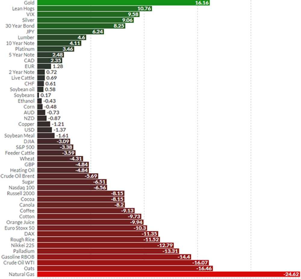
A Great Chart Showing YTD Asset Performance – A Keynesian Nightmare
The chart below shows returns on various asset classes in USD for the first two months of 2016. For me, I am long gold and silver, but also oil. An average start to the year. The chart is courtesy Financial Visualisations, a site that is well worth a visit.
So gold ( that “barbarous relic” – according to Keynesian folklore), has again out performed. Not surprising when we can now pay to buy NIRP bonds in Japan, Switzerland, Sweden and elsewhere. And soon, your Keynesian masters will be coming to take your cash away. And your gold. Probably your lean hogs too.

